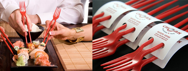
Early on, we wrote about The Chork, the combination chopsticks & fork utensil that seemed unique, fun….and well, just plain unusual. We’re not sure if this is the future of dining, but we especially like The Chork because it proved that A) design could differentiate; and B) design didn’t have to be expensive.
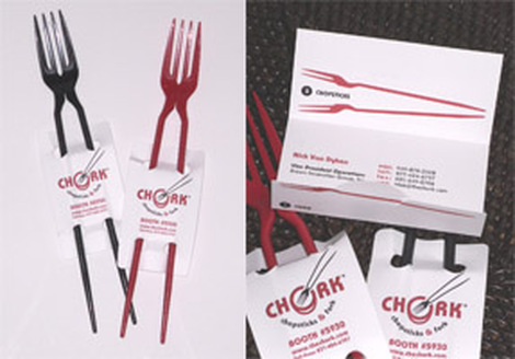
“But, then there became other obvious reasons to discuss The Chork and these discussions had to do with brand/product positioning, brand re-inforcement, and the like. From the beginning, we loved the packaging of The Chork and the collateral materials….right down to the company website and business cards. Everything spoke of design…fun….not expensive. So, the smart guys at The Chork completed the brand message all the way through. In fact, The Chork won multiple awards not just for product design, but for design of their marketing materials and message, proving our point. Often, when we think of great design…or of brand positioning….we tend to think expensive products, expensive marketing campaigns. The Chork is complete proof that creative campaigns can be done without breaking the bank. And – they can be done at all all product levels – whether you are a premium priced bourbon (Maker’s Mark) or an inexpensive, disposible chopsticks/fork tool called The Chork. You just have to be thoughtfully creative. You can learn more about The Chork, by going here: http://thechork.com/
Check it out…it’s a quick and easy website…..but you already knew it would be, now didn’t you?